Title Sequences
1) A title sequence is the method by which cinematic films or television programs present their film title, key production and cast members using the concept of vision by changing the font, point size line length, line spacing, tracking and the space between the letters.2) The function of a title sequence is to cover all the titles from the film, from the most important being the film title then it is also the part of them film that lists the people who create the film, the main actors etc in the film. So in a sense it is any written text and the beginning or the end of the film, not including scene text featured in the structure of the film or the subtitles.
3) Singing in the rain, Psycho and Juno are three of the films featured in the A Brief History of the Art of the Title Sequence clip there are the 3 most memorable and one's which stood out the most for me.
4. Select a film Title Sequence shown in the A Brief History of the Art of the Title Sequence and discuss how the Title Sequence uses Typography Elements (text), Visual Imagery/Sound Elements and what kind of mood/feeling is created as a result? Name of chosen Film Title Sequence: Use of Typography Elements (text): Use of Visual Imagery/Sound Elements: Mood/feeling:
The pink panther:
The Mirisch company presents
David Niven
Peter Sellers
Robert Wagner
Capucine in
'The pink pant her'...... The pink panther
With Brenda de Banzie, Colin Gordon, John Lemesurier, James Lanphier, Guy Thomajan
Michael Trubshawe Riccardo Billi Meri Wells
Martin Miller introducing Fran Jeffries...... and the pink panther
and with Claudia Cardinale as the princess
Music... Henry Mancini
Director of photography Philip Lathrop A.S.C
Claudia Cardinale and Capucine's wardrobe
Art Director Fernando Carrere
Set Directors: Reginald Allen, Jack Stevens, Arrgio Breschi
Make-up: Euclide Santoli, Michele Tremarchi
Hair dressing: Amalia Paoletti
and the pink panther
Associated Producer Dick Crockett
Screen play by Maurice Richlin and Blake Edwards..... and the pink panther
Produced by Martin Jurow
Directed by Elabk Sdrawed.....Blake Edwards
Through out the title sequence opening the Pink Panther song is playing. Along with the Pink Panther character doing silly things to the writing this seems to us that the film will be a comedy. This sound gives off a light but mysterious mood. The music makes it seem like a comedy and a light hearted film but the way the drawn character is messing around with the words suggests that we don't really know what's going on or the truth. The text is all in capitals so therefore stands out to the audience. By all words being written in capitals makes us think something big happens that we cant afford to miss. The colour throughout the title sequence is different shades of pink mostly. This relates to the name of the film.
5. What does the use of Typography Elements (text), Visual Imagery/Sound Elements in the chosen film Title Sequence suggest about the theme/content of the film?
The typography elements stand out to us as all words are written in capitals. This makes us watch closely, suggesting we need to do the same through out the film. This therefore reveals a theme of mystery. The theme of crime and investigation is brought to attention when the character within the title sequence is constantly rearranging the letters of words. This makes him seem like a criminal. Also when and gun a magnifying class are used as props. The sound suggests mystery and someone trying to solve a crime, this ties in with the themes of crime and investigation.
6. Select another film Title Sequence shown in the A Brief History of the Art of the Title Sequence and discuss how the Title Sequence uses Typography Elements (text), Visual Imagery/Sound Elements and what kind of mood/feeling is created as a result? Name of chosen Film Title Sequence: Use of Typography Elements (text): Use of Visual Imagery/Sound Elements: Mood/feeling:
The Vow:
Screen gems
Spyglass entertainment
Screen gems and Spyglass entertainment present
A Birnaum/Barber production
Rachael McAdams
Channing Tatum
THE VOW
Sam Neill
Scott Speedman
Wendy Crewson
And Jessica Lange
Jessica McNamee Tatiana Maslany Joe Cobden
Casting by Cathy Sandrich Gelfond Amanda Mackey
Music supervisors Randall Poster Stephanie Diaz-Matos
Music by Rachel Portman Michael Brook
editors Nancy Richardson, A.C.E, Melissa Kent
production designer Kalina Ivanov
director of photography Rogier Stoffers, A S C
co-producers Cassidy Lange Rebekah Rudd
executive producers J.Miles Dale Austin Hearst Susan Cooper
produced by Jonathan Glickman Paul Taublieb
produced by Gary Barber Roger Birnbaum
Throughout the duration of the opening sequence a relaxing, happy mood is created by the simple white titles and slow scenes. The sound is placed in the middle of the opening, this adds excitement and goes well with the happy mood already set. This sequence was not in the choice listing. However I chose to analyse it as it relates to the genre of my film opening. I though it would be good to analyse one of the same genre to get to know it better.
7. What does the use of Typography Elements (text), Visual Imagery/Sound Elements in the chosen film Title Sequence suggest about the theme/content of the film?
The opening scene is quite casual, with little going on and light music. this goes well as it then doesn't take away from the big event waiting to happen. The text is just plain white which could represent how the main female character looses her memory, her mind goes blank. Some names are written in capital letters, this stands out to us as important information. The genre off romance is shown when some titles are placed between both characters and are specifically placed when the two are doing couple like activities. Sound is incorporated when the couple are in the car together. They sing to one another. By placing this here it allows us to see the couple together as one, revealing the theme of love.
8.Visit the following website: Art of the Title watch the sequences and read the 6 Film Title Sequence interview with Richard Morrison. The videos are on vimeo and will take a little while to load so be patient.
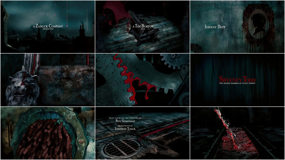
Sweeny Tod :
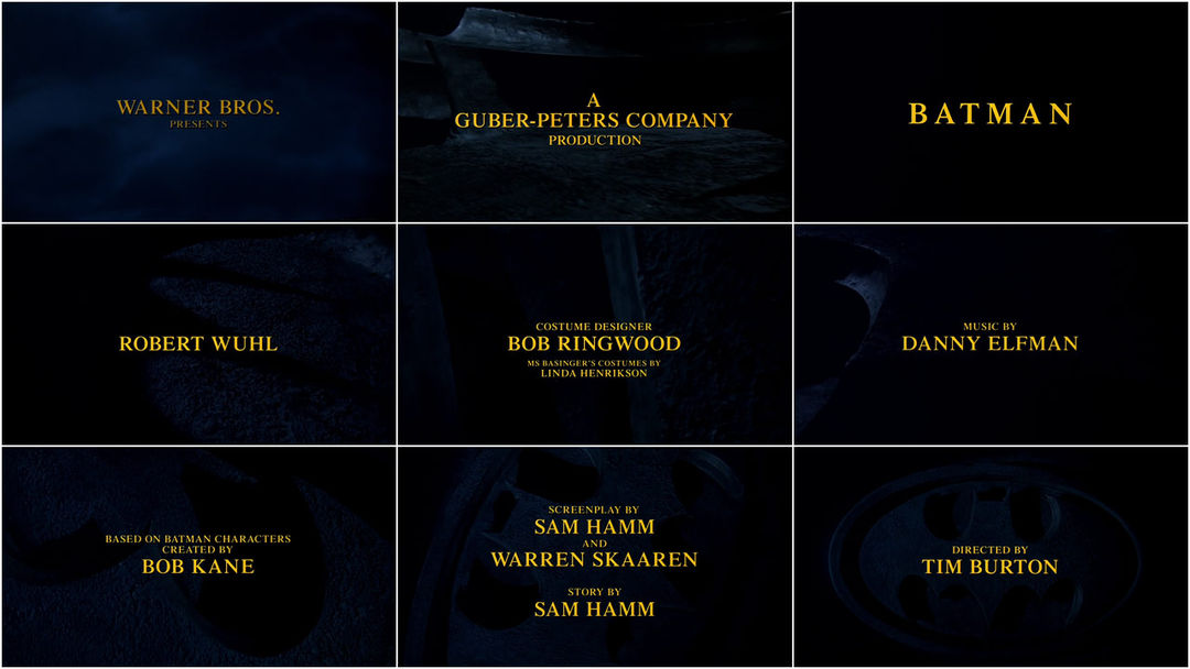
All typography elements are written in the colour yellow. This relates
to the costume of the main character, Batman. They are also written in
capital letter, standing out as important information.
However the most important titles, such as cast names, are in larger
fonts as opposed to the less important words. The main title 'BATMAN'
is in a much larger font compared to all other titles. This is because
it is the title wanted to stand out to the audience the most. The visual
elements are all dark, brining the theme of mystery to attention. As
the background is unclear we don't have a huge clue to what is really
going on, therefore we again see the theme of mystery and also crime.
The soundtrack throughout adds to the theme of mystery, starting out
slow and deep, it almost puts you on edge as some parts of the sound
elements are jumpy. Once we see the main title, Batman, the music
changes to a much faster pace which reveals the theme of action. The
music becomes a typical action hero theme tune.
9. What does the use of Typography Elements (text), Visual
Imagery/Sound Elements in the chosen film Title Sequence suggest about
the theme/content of the film?
In the Sweeney Todd title sequence the typography, visual and sound
elements all suggest things about the genre of the film. The colours
relate to blood and death which suggest the film is a horror. The sound
elements throughout put us on edge which suggests to us that we may feel
like this at point during the film. The medieval-like music tells us
that the film may be set in passed times.
10. What does Richard Morrison explain about the Film Title Sequence?
Richard Morrison says "Animating blood and its movement became the most crucial and challenging element of the sequence. we had to build special platforms within which we imitated blood movement and filmed it. And we had to give it this comical feel, which worked really well. That was a dream project. We would love to work on something similar."
11. Does Richard Morrison feel the Film Title Sequence was successful, why or why not? Name of 2nd chosen Film Title Sequence created by Richard Morrison: Use of Typography Elements (text): Use of Visual Imagery/Sound Elements: Mood/feeling:
In the Batman title sequence again typography, visual and sound elements are all used to suggest the genre and clues about the film itself. Throughout the sequence the visual elements are very dark, it is hard to make out what is actually being shown on the screen. This suggests a main theme of mystery as we cant actually see the whole picture. This further suggests that we will need to pay close attention to the story line. The soundtrack is fascinating which tells us we will see something we don't see in everyday life. Finally the text is very bold and striking suggesting the genre of action during the film. Richard Morrison says "The Batman 1989 environment was not that homogenized. In fact, there weren't many people on the same platform and we were all very individual. Tim and I walked around the set of Gotham city. And that was it, really.I clearly remember I sat back in the car and all
of a sudden, I knew it. I knew it has to be something about the classic Batman comic logo. So that was the idea and then I just invented the world around it. Nobody did anything like it before so that's why it probably retained its timeless feel." Saying that 'Nobody did anything like it before' tells us that Morrison did find the sequence successful as it was something never seen before and it also didn't become boring.
Psycho
At first look this sequence appears plain and boring as it is based on a black background with white writing. But they use the lines, again black and white, to makes it more visual, this makes the text hard to read and you are trying to read it quickly also the lines make it confusing. Also this keeps the viewer on edge. As the word "psycho" is a confusing person and being around a psycho would keep you on edge the use of imagery reflects the word and therefore the genre well. Also you imagery doesn't follow a sequence it is constantly changing in crazy ways, as a psycho would. The sound is short and snappy keeping you on edge like the use of the lines did also it sounds like its building up to something, which would be the film. The sound reflects the imagery and adds to the being on edge feeling. As I have already explained it makes you feel on edge and uncomfortable, as a psycho would reflecting the genre. It also suggests that the film throughout will have you on edge and feel uncomfortable as all aspects of the title sequence makes you feel like this, and as the title "psycho" is emphasised it makes you presume its about psycho.


No comments:
Post a Comment